The Most Important Shopify Advertising Tool

Shopify Paid Advertising Secrets
The internet is amazing for small businesses when it comes to pure visibility. If you utilize Shopify paid advertising options, and put up a reasonable daily budget, your ads will be seen by potential customers browsing online.
The question becomes… what do you tool with the data gathered from advertising via Shopify? How can you make incremental improvements on your ad campaigns without draining your budget?
Crucial Customer Data to Collect
The most important Shopify advertising tool is organized, cogent customer data analytics. To increase sales on Shopify, business owners need to know who interacted with their ads down the most specific detail:
- Where did the user see my ad?
- Did they click through?
- How much time did they spend on my site?
- Did I capture their email or other contact info?
- What demographic are they? (age, gender, profession, location, income level, etc…)
The phrase “actionable insights” is probably overused at this point, but it comes from fact that any good advertising strategy for Shopify involves customer data collection and analysis. Otherwise, business owners are likely to keep trying the same strategy over and over – the definition of insanity!
When trying to figure out how to advertise with Shopify, focus on allocating your daily budget towards a customized, highly targeted audience. That will ensure your ads are seen by hundreds to thousands of customers across the Internet and social media. That way, even if they don’t buy right away, your business builds a cache of customer data that informs your next steps. As long as you can make sense of the customer data you collect, your Shopify paid advertising campaigns will get stronger and more targeted right to your audience 😊
Ad360 – The Ultimate Shopify Advertising Tool
Ad360 takes this one step further by automatically managing your ads to take action based on your customer data. The campaigns run by Ad360 will automatically adjust based on customer’s behavior to maximize your business outcomes! The best part is that you can start ads in one click! From there, Ad360s intuitive central ad dashboard automatically organizes the metrics you need to increase your sales on Shopify 😉
Try for yourself the Ad360 App for Shopify with a 14-day Free Trial!
Amazon reveals “Buy with Prime”!

Amazon revealed yesterday a new service for merchants: “Buy with Prime”.
For the first time, merchants outside of the Amazon.com marketplace will be able to offer the same benefits to Prime customers as they get on Amazon. This includes free shipping, next-day delivery, and free returns!
To be eligible, members will need to be part of the “Fulfillment by Amazon” (FBA) program in which Amazon takes care of the warehousing, shipping, and returns.
Through this new service, Amazon clearly wants to accelerate with FBA and take on additional market share, especially with Direct to Consumer (DTC) and long-tail merchants.
That’s why many analysts see this move as a jab at Shopify’s business.
Subscribe to Ecommerce Success by Ad360, the channel where we share tips, news, best practices to help business owners be happy, productive, and successful!
Ultimate Guide to Facebook Retargeting

While Facebook ad retargeting is effective, there are limitations to promoting products solely through social media! This post explores how to broaden your online store’s visibility, and use “layered retargeting” to reach customers across the entire Internet – not just Facebook 😊
Increase Sales on Shopify by Retargeting Outside of Facebook
Business Owners using Facebook ads may have noticed that, while effective, there are clear limitations to advertising on the Facebook network. Sure, it gives access to popular platforms like Instagram, but remember there are roughly 5 billion people who use the internet regularly! While Facebook has ~2 billion regular users, you miss out on 3 billion potential customers by showing ads only on Facebook.
Who knows? Your niche audience may not be big fans of Mark Zuckerberg 😉 To increase sales on Shopify, business owners need to find ways to look beyond advertising only on social media. While it’s undoubtedly effective, there are marketing tactics that layer ad retargeting, thereby reaching users in and outside of Facebook.
The Undeniable Effectiveness of Ad Retargeting Campaigns
If you aren’t already making use of Facebook’s ad remarketing features, it is time to hop on board. A recent survey of 320 companies found that 86.4% used retargeting campaigns, and over half of those businesses increased their revenue through ad retargeting campaigns. In other words, the metrics speak for themselves. After creating the right custom audiences and setting a reasonable budget, retargeted Facebook ads can help increase sales on Shopify.
… But let’s analyze those numbers a little deeper. While retargeting on Facebook has its merits, 20% of e-commerce businesses in the same survey reported no benefits from their retargeting campaigns.
So, we decided to dig a little further and ask, “Is there a way to broaden retargeted Facebook ads beyond social media?” Doing so, and placing ads in different contexts, may be the key to giving these ad campaigns a boost – and increase sales on Shopify in the process.
Limitations of Advertising on Facebook
First, we need to identify the limits of Facebook ads.
50% of customers online say they like shopping through platforms like Facebook stories… but what about the other 50%? If you are limited to retargeting only through the Facebook (Meta) network, you are potentially losing out on reaching half of your customer base. Other users want to see ads in different online contexts – beyond their social media account!
To increase sales on Shopify, it is best your e-commerce business gets exposure beyond social media.
Why? Credibility and Brand awareness.
Showing ads to retargeted users – when they are not on Facebook itself – is impossible with Facebook’s software. That could mean the impact of your retargeted ads are limited, as customers will be inclined to write your brand off as, “That store that only pops up on Facebook.”
To many, that limitation could hurt your brand and make it look less legitimate in the eyes of potential customers. Layering on a broader retargeting service will allow you to show ads to those same users not just on Facebook – but across the entire web. This enhanced brand visibility will make your store appear more viable in the eyes of potential customers, driving more traffic and increasing your sales on Shopify.
Layering “Web” Retargeting on Top of Facebook Retargeting
They key to maximizing the effectiveness of your ad retargeting campaign is to reach beyond social media, and use tools that enable retargeting across the web.
In that scenario, an online user could see your ad on Facebook first, then have a moment of déjà vu when the same ad pops up while they browse a news app on their phone! When the ad appears a third time on their favorite independent blog site, the credibility of the brand has been confirmed in the eye of the customer.
Seeing the store’s promotions in multiple online contexts makes them feel like checking the store out is worth their time, as it engaged them with multiple touches without appearing repetitive. This is the power of layering web retargeting on top of Facebook retargeting – you reach customers when they are in different states of mind, upping the chance they take note of your online promotion. The broadened visibility can help increase your sales on Shopify and boost your brand’s reputation.
Conclusion: Use Menadex to Layer Web Retargeting on top of Facebook
Hopefully by now, you see the promotional power of ad retargeting online businesses. However, very few businesses know how to layer web retargeting on top of their advertising efforts on social media. Broadened web visibility could be the keystone to increasing sales on Shopify!
If you want to get the best return on your ads spent (ROAS), try a free demo by Ad360 today! Our Menadex media offering will automatically layer web retargeting on top of your existing ad campaigns, ensuring you get the broadest appeal and best bang for your buck.
Maximize Google Ads with 360° Retargeting
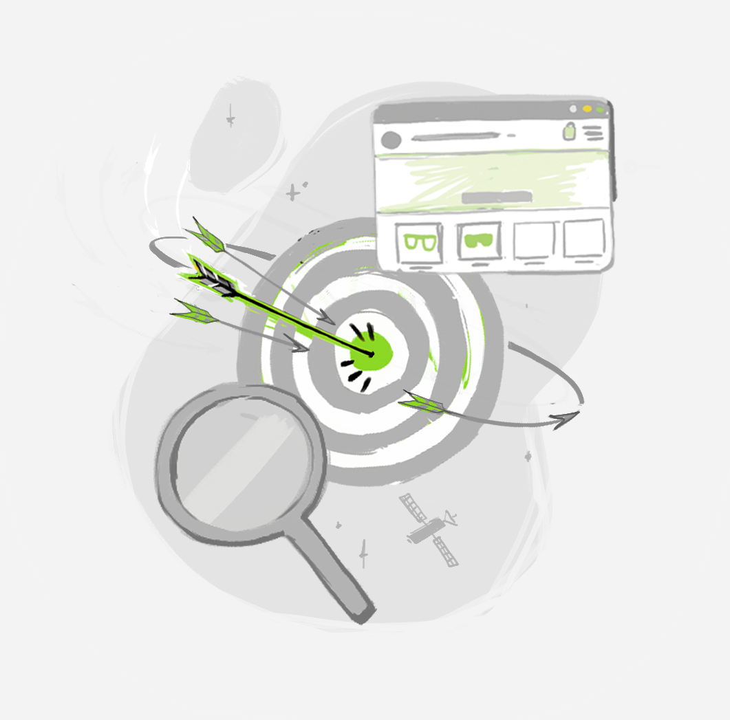
Retargeting Squared: Increase Sales on Shopify with Layered Ad Retargeting
If you have kept up with our previous posts on retargeting (click here, here, and here for a refresher course), you know that retargeting is arguably the most effective digital marketing strategy on the web.
That means for online business owners, learning the fundamentals of retargeting are essential if you want to succeed and increase your sales on Shopify!
However, did you know that there are ways to deploy “layers” of ad retargeting? The value of this tactic is simple: you reach your audience across all search engines and platforms – rather than being restricted to a single network. In other words, layered ad retargeting empowers e-commerce business owners to target users not only on sites like Facebook and Google, but it allows them to continue showing ads to users as they browse the millions of Independent sites across the web.
Check out this post for a 2-step guide on how to layer ad retargeting to maximize conversions and increase your sales on Shopify 😊
Step 1: Ensure you Have Ad Remarketing Enabled on the Baseline Platform
To start, remember that platforms like Google offer their own remarketing programs that can be toggled on. This is a no-brainer. If you are not already using this baseline ad retargeting technique, you are allowing ~98% of all of your web traffic to “fall through the cracks.” With no way of knowing how has visited your site, your digital marketing strategy will continue to feel like “finding a needle in a haystack.”
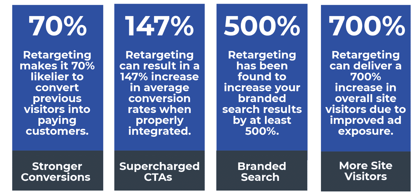
Step 2: Layer Ad Retargeting that Works Across the Entire Web
Now that you have established ad retargeting on the specific platform in question (e.g. – Google), it is time to layer up! Using a simple app, e-commerce owners can reach outside of Google’s network when showing ads to retargeted users.
What this means is that is the user clicks on an independent site not under the Google Display Network, your ads can still be shown to the user! This layered retargeting tactic broadens appeal, and the numbers make a clear case for its effectiveness.
There are currently ~2 million websites linked to the Google Display Network… but there are over 200 million active websites across the web! So, by layering on external ad retargeting on top of Google’s remarketing option, you reach roughly 198 million more sites with your digital marketing. After considering these figures, there is a strong case to be made that layered ad retargeting could drastically increase your sales on Shopify.
Conclusion: Menadex by Ad360 Can Unlock Your Online Store’s Potential
For a quick solution to “layered ad retargeting,” Ad360’s Menadex media offering connects your e-commerce promotions to every active website on the internet. That way, your store can show ads to retargeted customers on websites that your competitors cannot reach, giving you the advantage in brand exposure and customer awareness.
If you want to see the impact that layered retargeting can have on your business, reach out to try a free demo from Ad360! We’ll automatically begin layering in our platform’s “universal ad retargeting” services on top of the ones offered by platforms like Google. Create your next ad campaign with one click, and increase your sales on Shopify today 😊 Happy selling!
The Basics of Shopify Store Design

You don’t need to be a design expert to give your e-commerce store a little creative flair 😊 A simple, bold, dynamic aesthetic will attract customers to your site, and keep them there. Read our refresher of how to increase sales on Shopify through upgrading your store design.
Aligning Theme Colors with Your Brand
There is no need to clutter your e-commerce site with pictures and text if your background is aesthetically pleasing. In fact, online stores that are well-spaced, and give the customer a chance to “breath” as they browse from webpage to webpage, outperform ones crammed with “too much.”
Thus, picking simple, bold, consistent theme colors is an easy way to increase sales on Shopify. Remember that the colors don’t have to take up the same amount of space on your site! Some may color the toolbar across the top, while others dominate the space behind your pictures, text, and product listings. Check the links here and here to get some new ideas on how to freshen up your theme colors – it could help boost your Shopify sales!
Dynamic Media: How Should You Incorporate Pictures & Video?
If you are going to utilize lots of multimedia, make sure your site’s speed is optimized. Big files uploaded to your e-commerce site can make it clunky and slow to users.
Every online store is different, so you can play around with your incorporation of pictures and video. Some opt for a central image to focus user attention, while others break up their homepage into “blocks,” with each section conveying a different feature of their products and services. Other put a video front-and-center to engage the user right away, and give a flavor of what their product looks like in action!
Check out a list of excellent online stores here and here – you may pick up a key tip to increase your own Shopify sales!
Well-Placed Interactive Buttons
Another aspect of site design to consider is where you put “clickable” buttons – including the following dynamic items:
- “Call to Action” buttons
- Social media links
- Trust badges
- links to specials or products on sale
To increase your Sales on Shopify, having these “clickable” buttons across your webpages make it more interactive and easier for users to navigate. If you have a product on sale for the next month, for example, you may want to update your site to reflect that! Adding in a “click here for our new special” button may entice customers that would otherwise keep browsing.
We’ve talked about the importance of CTA buttons placed strategically across your homepage and product pages. They should land in spots where a customer has taken in key text, images, or videos, and may be pushed to buy items if you make it easy for them. Place CTA buttons around key text, images, and videos! It makes shopping easier for the customer and will help increase your sales on Shopify.
At the top of bottom of your page, have your clickable buttons for links to social media, as well as certificates from your trust badges. They are easy to place and bring extra layers of connection and credibility to your Shopify site,
Conclusion: Shop Design is Fundamental to Increasing Sales on Shopify
Re-evaluate your Shopify store design regularly – testing out different layouts and designs is not as hard as you think. It can have a marked impact on your store’s success, so be sure you are keeping a fresh, open perspective on the options for your Shopify theme and store layout!
If you want help evaluating your online store’s design, reach out for a free demo by Ad360 today. We can audit your current site, giving you actionable tips to increase your sales on Shopify 😊 Cheers, and happy selling!