The Basics of Shopify Store Design

You don’t need to be a design expert to give your e-commerce store a little creative flair 😊 A simple, bold, dynamic aesthetic will attract customers to your site, and keep them there. Read our refresher of how to increase sales on Shopify through upgrading your store design.
Aligning Theme Colors with Your Brand
There is no need to clutter your e-commerce site with pictures and text if your background is aesthetically pleasing. In fact, online stores that are well-spaced, and give the customer a chance to “breath” as they browse from webpage to webpage, outperform ones crammed with “too much.”
Thus, picking simple, bold, consistent theme colors is an easy way to increase sales on Shopify. Remember that the colors don’t have to take up the same amount of space on your site! Some may color the toolbar across the top, while others dominate the space behind your pictures, text, and product listings. Check the links here and here to get some new ideas on how to freshen up your theme colors – it could help boost your Shopify sales!
Dynamic Media: How Should You Incorporate Pictures & Video?
If you are going to utilize lots of multimedia, make sure your site’s speed is optimized. Big files uploaded to your e-commerce site can make it clunky and slow to users.
Every online store is different, so you can play around with your incorporation of pictures and video. Some opt for a central image to focus user attention, while others break up their homepage into “blocks,” with each section conveying a different feature of their products and services. Other put a video front-and-center to engage the user right away, and give a flavor of what their product looks like in action!
Check out a list of excellent online stores here and here – you may pick up a key tip to increase your own Shopify sales!
Well-Placed Interactive Buttons
Another aspect of site design to consider is where you put “clickable” buttons – including the following dynamic items:
- “Call to Action” buttons
- Social media links
- Trust badges
- links to specials or products on sale
To increase your Sales on Shopify, having these “clickable” buttons across your webpages make it more interactive and easier for users to navigate. If you have a product on sale for the next month, for example, you may want to update your site to reflect that! Adding in a “click here for our new special” button may entice customers that would otherwise keep browsing.
We’ve talked about the importance of CTA buttons placed strategically across your homepage and product pages. They should land in spots where a customer has taken in key text, images, or videos, and may be pushed to buy items if you make it easy for them. Place CTA buttons around key text, images, and videos! It makes shopping easier for the customer and will help increase your sales on Shopify.
At the top of bottom of your page, have your clickable buttons for links to social media, as well as certificates from your trust badges. They are easy to place and bring extra layers of connection and credibility to your Shopify site,
Conclusion: Shop Design is Fundamental to Increasing Sales on Shopify
Re-evaluate your Shopify store design regularly – testing out different layouts and designs is not as hard as you think. It can have a marked impact on your store’s success, so be sure you are keeping a fresh, open perspective on the options for your Shopify theme and store layout!
If you want help evaluating your online store’s design, reach out for a free demo by Ad360 today. We can audit your current site, giving you actionable tips to increase your sales on Shopify 😊 Cheers, and happy selling!
How to Present your Offer to Convert More

Welcome to Ecommerce Success by Ad360, the channel where we share tips, news, best practices to help business owners be happy, productive, and successful!
This e-commerce business owner wants to increase conversions for a specific offer.
Let’s review their website and how they present this offer.
The way you introduce an offer, the level of detail you give, which Call to Action (CTA) you use, and how you highlight it on your website matter a lot to maximize your conversions.
Subscribe to our YouTube channel “Ecommerce Success by Ad360” to watch daily videos that share tips, knowledge and best practices with merchants to help your business thrive!
If you’d like me to do a more in-depth analysis of your advertising setup / targeting options / campaigns data, feel free to book a call using the link below:
Choice Overload is hurting Conversions

Welcome to Ecommerce Success by Ad360, the channel where we share tips, news, best practices to help business owners be happy, productive, and successful!
A Landing Page is where users land after clicking on an ad. Usually, Landing Pages are laser-focused towards your main goal in that context. If your website sells different categories of products, appealing to various audience segments, you should probably have multiple Landing Pages, with each targeting a specific audience segment and/or product.
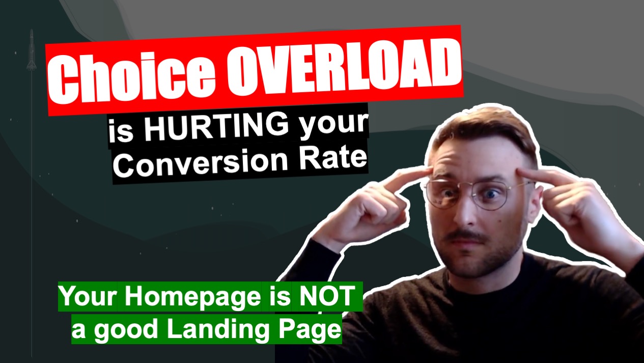
The reason why the Homepage doesn’t make for a good landing page is that it usually contains varied content. Perhaps counter-intuitively, having more options isn’t necessarily a way to increase the probability of your website visitors to take an action.
Quite the contrary actually says the Choice Overload paradox: having too many options to choose from deters some users from making a choice at all.
For this reason, a Homepage containing a lot of different products may have a lower conversion rate than a dedicated landing page, meaning that in most cases, you don’t want to bring users who click on your ads towards your Homepage.
Wishing you a lot of success!