Budgeting for Facebook Ad Success
Introduction: A Dollar Spent, 10 Dollars Earned
Return on Ads Spent (ROAS) is a key metric for companies advertising online. Businesses may have budgets of different sizes, but many of the core elements of running the campaign remain the same.
Successfully setting a daily Facebook ad budget, testing different ad sets, and engaging the target audience multiple times are all key to growing your Shopify sales. A little marketing planning can go a long way here, so make sure to have a blueprint in place before you begin!
Setting a Daily Budget
First off, Facebook ads provides an option of setting a “daily” or “lifetime” budget – we’d opt for the daily budget while starting out. It provides a chance for more flexibility as the promotional campaign developers.
An amazing feature of Facebook ads is that Shopify businesses do not have to “break the bank” to reach their audience – even $10/day is enough to have your ads be sent out across the 2.7 billion Facebook users! If you consider yourself a “Small-to-Medium” sized store at the moment, aim for a daily budget between $10-30. Your ads will be seen, and the data collected from their performance metrics will be invaluable in how you further develop the campaign.
Test Ad Sets before scaling up
When framing your Facebook ad campaign, remember it’s not just one ad banner you are sending out your entire audience! Remember from our post on Facebook custom audiences that effective Facebook ad campaigns segment their audiences based on key factors (e.g. – demographics, location, interest). For each custom Facebook audience, you likely will roll out a different “ad set.”
Each ad set is specifically targeted to one of your custom audiences, and from there, you can try different versions of the ad as a form of A/B testing. For example, you may have three ad sets prepped for three distinct custom audiences. Within each ad set, you roll out two versions to see which one better drives engagement and boost traffic to your store!
Better to Reach an Audience of 100 10 times than 100,000 people Once
Finally, please note it’s better to concentrate your ad sets to smaller audiences you can reach multiple times, rather than blasting out a single ad to larger audiences. Marketing research has shown that customers need to see your ads 7-8 times before they consider purchasing something from your store.
Thus, it’s more efficient to have a small audience you show multiple ads to rather than a broad audience who briefly see your ads only once. Facebook ads breaks up these factors into awareness, consideration, and conversion. You may have also heard of concepts such as AIDA (Awareness, Interest, Desire, Action) that conceptualize how customers are funneled to drive sales to your store. As you scale up your ads, remember the average customer needs exposure to your store’s promotion multiple times. Otherwise, your ROAS will suffer.
Conclusion: Who can Help Analyze my Facebook Ad Data?
After running a Facebook ad campaign, setting a daily budget, and releasing your various ad sets, it can feel confusing how to make sense of the data collected – that’s where Ad360 steps in! We specialize in analyzing your customer data and subsequently optimizing future campaigns. Better ads mean more sales, so please reach out to try a free demo by Ad360 today!
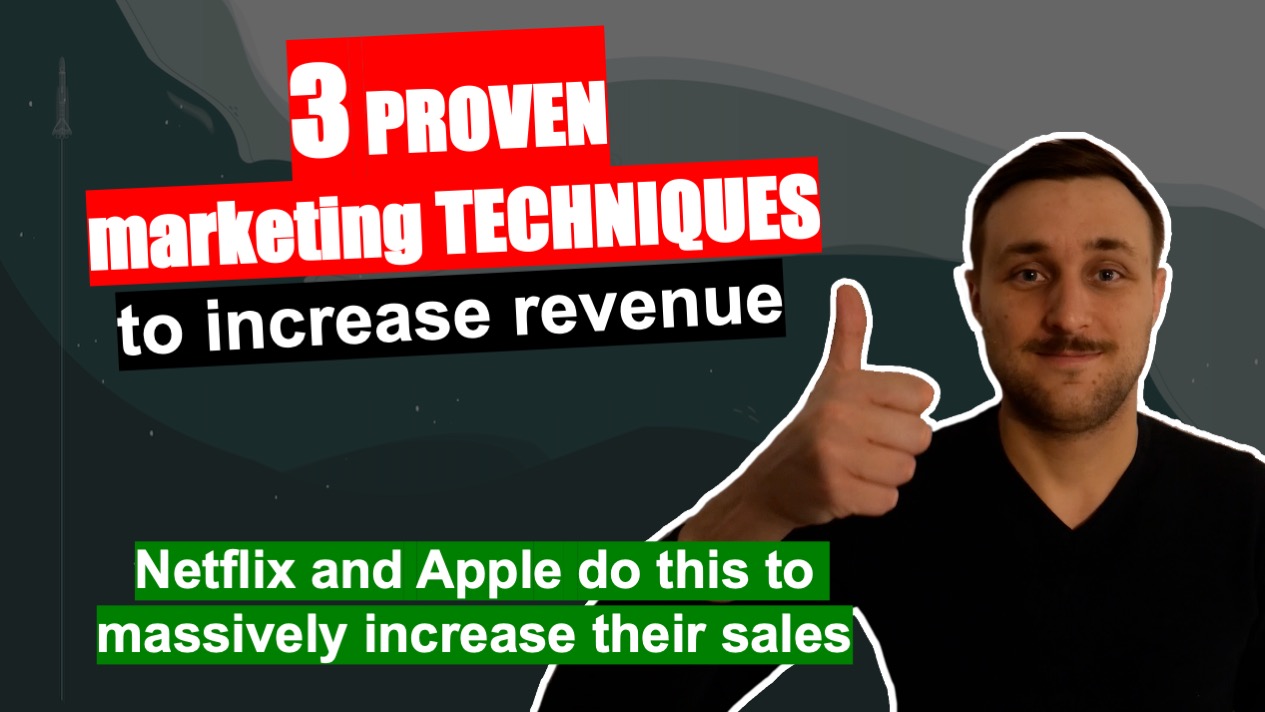
3 marketing techniques to increase revenue
Welcome to Ecommerce Success by Ad360, the channel where we share tips, news, best practices to help business owners be happy, productive, and successful!
In today’s video, we’re reviewing a website shared on Reddit.
Firstly, they are doing a lot of things right! The website is beautiful, the content is great, the brand feels personal and relatable, and the products are beautiful!
In the video, we review the website, explaining how the business owner applied e-commerce website design best practices to make an efficient store.
Secondly, we review a free Search Engine Optimization (SEO) tool from Google to evaluate the page performance score. This matters increasingly as Google search engine results are now ranked partially based on the page experience (including loading speed).
Lastly, the video introduces 3 marketing concepts which are proven to increase revenue considerably, and which we believe could be hlpful for this website:
1/ Value & pricing ladder
2/ Price anchoring
3/ Compromise effect
Ssuccessful companies like Apple or Netflix use these marketing techniques to increase the average order value and their sales.
If you’d like us to do a more in-depth analysis of your advertising setup / targeting options / campaigns data, please book a free consulting call with Ad360’s team.
Deal with Custom Audiences in Facebook
Custom Audiences = Complexity Explosion
In our previous article reviewing the basics of Facebook Ads, we touched on the importance of building custom audiences with Facebook’s features.
Age, gender, location, and Interests can all be modified for custom audiences… and… well… the sheer number of combinations that can be made from these factors alone is remarkably complex. Even the term for its growing sophistication takes your head for a spin… combinatorial explosions. Sheesh.
But no worries – this blog post takes a deeper dive into the complexity that comes with building multi-factor custom audiences on Facebook. While each essential for succeeding with a modest marketing budget on Facebook, so all Shopify business owners, take out a piece of paper and #2 pencil! This analysis goes “all in” on the complexity of creating custom audiences for Facebook
Why Are Custom Audiences So Important for Facebook Ads?
The first point to note: you need to build multiple custom audience combinations for marketing success on Facebook. It’s a response to the sea of 2 billion users out there, being exposed to ad banner after ad banner as they scroll down their news feed.
Think of it like this – if you had the time and resources to create a unique, tailor-made ad for each individual customer, sales would increase infinitely. So long as the data-gathering methods are clearly stated, consumers vastly prefer customized ads to overly generalized ones. Because you can create up to 500 custom audiences on Meta, we suggest taking full advantage of that by creating more custom audiences, not less.
Now, here’s where the concept of “combinatorial explosions” comes in – curating an individual ad for anything over a few customers is impossible. That would mean creating a “custom audience” of one, potentially thousands of times over. What if you are trying to reach a customer base of 50,000?
The Basics of Building Custom Facebook Audiences
After clicking “custom audience” on Facebook ad’s interface, there are four broad categories you can break the “audience factors” into:
Data source
Helps you target potential customers based on how they have engaged with your online store so far. Have they visited the site already? Specific web pages? Have they spent a substantial amount of time browsing? And are you pulling from web traffic, Facebook page engagement, Instagram, or some other data source? Remember, these customers may be in varying stages of the “AIDA” framework (awareness, Interest, Desire, Action). Therefore, breaking down your custom audience by analyzing their story through data points will inform how to further engage them to increase sales.
Demographics
Pretty straightforward – are you aiming for male, female, or nonbinary audiences? What age brackets? For example, if you are selling cheap vintage tees with a female cut, you are likely targeting women ages 16-35. Overall, demographics are a key component of creating effective custom audiences that drive sales.
Location
Aiming to reach the entire USA is far more costly than trying to reach a single state or region. So, make sure to tinker with different location settings based on your customer data. If you cast too broad a net, you’ll dilute the ability to keep engaging with that customer base; it will become too cost-prohibitive.
Interests
This is where things get interesting. Stacking and layering interests is key to creating target audiences. As you narrow down and tailor each custom audience, you can add interests that create a fuller picture of the users you are trying to reach. Most importantly, focus on the fact you can target individuals with “Interest A or Interest B,” as well as, “Interest A and also Interest B.” Both serve very different functions, as explained below!
“Stacking” or “Layering Interests” – Be Specific as Possible to Increase Ad Effectiveness
Specificity is crucial to have your ads compete with larger-budget businesses. For example, you could adjust the settings to advertise only to males 18-34 on the East Coast who have an expressed interest in sports or sports apparel
Even more, you can “stack” or “layer” interests to bring laser-precision to your custom audiences. Using the example above, interest stacking could set an audience that shows ads only to males 18-34 on the East Coast, who have an expressed interest in sports/sports apparel or have liked the official NBA, NFL, MLB, or NHL Facebook pages!
In contrast to “stacking,” interest layering more effectively narrows down your target audience. You could set an audience that shows ads only to males 18-34 on the East Coast, who have an expressed interest in sports/sports apparel and also have liked the official NBA, NFL, MLB, or NHL Facebook pages! Effectively “layering” interests for your custom audiences mean each ad creative will be tailor-made for different segments of your audience. The more layers, the more precise the audience. You can also exclude certain segments of these audiences to make the ad campaign’s target outreach even more efficient
Depending on the size of your business, the “sweet spot” may be anywhere from 50,000 to 1 million+ Just remember… the budget goes up the larger audience you have! On modest marketing budgets, it’s better to reach an audience of 1,000 with multiple ads to drive engagement, rather than reach an audience of 100,000 just once. The latter will be breezed over by users, driving no traffic nor sales to your store.
Conclusion: Deal Better with the Complexity of Custom Audiences thanks to Automated Software
Figuring out which custom audiences to create, based on which data sources, demographics, locations, and interests, becomes an exercise in compounding complexity. There are hypothetically hundreds to thousands of effective custom audience combinations for your store, and knowing which ones optimize your store for sales success is a full time job, if even possible.
Therefore, we recommend deploying automated software provided by Ad360 to bring laser-precision to your custom audience curation for Faceboook Ads. Not only do we specialize in analyzing user data for promotional campaigns, the time saved going through it yourself will be a massive burden lifted from your shoulders.
Concluding, Ad360 offers a free demo to help optimize your Faceboook ads and custom audience curation. We’ll handle the complexity of combinatorial explosions for you 😊 Cheers, and happy selling!
Boost your Shopify Store with Facebook Ads
Simple, Bold Strategies to Boost Sales with Facebook Ads
Introduction – Reach a Sea of Two Billion
While Gen Z may complain that Facebook is “lame” now, or “Meta” as we should be calling now, that is far from the truth when it comes to using Facebook Ad campaigns. 2 billion users is nothing to scoff at, and Facebook has built a remarkable ad platform to help Shopify business owners reach a wider target audience.
This blog post examines how Facebook ads are unique from Google Ads, as well as how targeting potential customers based on interests – rather than preferred keywords – could be the keystone to increasing your sales!
The Basics: Account Setup & Goals
First things first, you need a Facebook business account set up with an ad account in place. Once you have Pixel (Facebook’s answer to Google Analytics) activated, connect your Shopify store! You can do so by downloading the “Connect Meta” app on Shopify.
Next up, pick the “goal” of your ad. If you were in the military, this would act as the primary objective – we’d recommend starting with “boosting traffic” or “conversions” to start, but Meta lists 11 different objectives here. Depending on where you feel your target customers are in the “sales funnel,” you may want to simply bring awareness, get views, generate leads, or drive engagement.
Target Audiences: Time to Pick your Lane
Perhaps the most important decision for any ad campaign is designating your target audience. Facebook allows you to segment customers into the following classifications:
1. Age
Self-explanatory. Are you targeting the Gen Z or old folks? Picking a specific age demographic usually helps your ad campaigns effectiveness and efficiency in driving sales.
2. Location
Again, straight-forward. You can narrow down what region of the world you are placing your ads. With Ad360’s software supporting your Facebook ad campaign, you can narrow down the search to a single city block!
3. Interests
This is where Facebook Ads can differ significantly in their function from Google ads. Because Facebook collects profile data on all 2 billion+ users, setting customer interests can focus on their hobbies, interest categories, page likes, searchable keywords, Facebook usage, or online buying history.
Pick hobbies listed on the Facebook Ad dashboard that align with your product (e.g. – a basketball player is targeted with Nike shoes ad). Interests listed in their “Information about me” (e.g. – a fashion lover is targeted by a vintage clothing site) can also be important to consider when optimizing your ad placements for maximum sales growth!
“Stacking” or “Layering Interests” – Get as Specific as Possible to Increase Ad Effectiveness
Specificity is crucial to have your ads compete with larger-budget businesses. For example, you could adjust the settings to advertise only to males 18-34 on the East Coast who have an expressed interest in sports or sports apparel
Even more, you can “stack” or “layer” interests to bring laser-precision to your custom audiences. Using the example above, interest stacking could set an audience that shows ads only to males 18-34 on the East Coast, who have an expressed interest in sports/sports apparel or have liked the official NBA, NFL, MLB, or NHL Facebook pages!
Interest Layering more effectively narrows down your target audience; it could set an audience that shows ads only to males 18-34 on the East Coast, who have an expressed interest in sports/sports apparel and also have liked the official NBA, NFL, MLB, or NHL Facebook pages!
In short, effectively “layering” interests for your custom audiences mean each ad creative will be tailor-made for different segments of your audience. The more layers, the more precise the audience. You can also exclude certain segments of these audiences to make the ad campaign’s target outreach even more efficient.
Conclusion: What to Do if Facebook Ads Feels Too Technical or Overwhelming
In conclusion, there are a lot of moving variables that factor into your Facebook ad campaigns. Straddling this granular level of detail over several social media platforms can definitely make your head spin. If you feel you could use some support analyzing and bringing all your different ad channels under one roof, reach out for a free demo by Ad360 today! We’ll make it our mission to optimize your next Facebook ad campaign for success 😊
Google Ad Secrets for your Shopify Store
Introduction – Being “Seen” on Google Search
With 8.5 billion searches executed a day, Google Ads are a primary promotional tool for Shopify owners. However, it’s not as easy as “1, 2 3,” to suddenly begin boosting traffic to your store and converting sales with Google ads. In fact, a large majority of Shopify store owners express a certain level of discontent when trying to optimize their Google ads efforts.
One even said, “It’s at the point where I would pay someone to do my Google Ad campaigns if they know what they are doing.”
… Well guess what! This blog provides the 360° view on how to organize Google ad campaigns to maximized sales. There is a way to compete with retail giants with Google ads, so long as you are razor sharp in establishing your target audience, network, and keyword phrases. Read below to learn how to approach your Google ad campaigns for increased sales and Shopify success!
Basics of Setting up Google Ad Campaigns
To start, let’s establish that Google Shopping ads reach over a billion users, and 75% of shoppers regularly use Google products when browsing online. While starting a Google Ad campaign does cost money upfront, it is a worthy investment if you can establish a strong marketing strategy beforehand.
First, you need to establish a location and network – what region are you trying to reach with your ads? The Entire USA? A region like the West Coast? A single state, city, or neighborhood? Precision here will save you money, so make sure you know exactly who you want to reach
From there, Google has multiple networks to run ads on, but we’ll focus on search engine ads and Google Display ads to provide the basics. Simply put, search engine ads are the “promoted results” that appear at the top of the page when users conduct a search. With the right keywords, your products will be displayed right alongside giants like Wal Mart and Amazon. That way, shoppers are exposed to your store, appearing as just a viable option as any! The exposure from promoted search ads drive sales for Shopify stores, so they are worth considering.
The second major network are Google display ads, which appear as those little banners or sidebars that pop up while users search the web. In other words, a potential customer may be looking up news or their favorite content from a Google search, and the display network is smart enough to follow them and, should you place a bid, display your ad across the internet for searches that originated with Google. The Google Display Network reaches 90% of all internet users around the world so… yeah. Worth checking out to increase your Shopify store sales 😊
Keywords, Keywords, KEYwords
It takes a bit of vision and research, but picking the right keywords for each ad campaign is a crucial step to optimizing their success. Every business and niche product has a different set of keywords, but it’s best to ask, “What are most likely the words and phrases people type in when looking for a product like mine?” Conduct market research from there to make sure you align your keywords with what likely customers type into the Google search bar.
Generating Quality Ad Banners
After conducting the necessary market research, it is time to tap into your inner graphic designer, and create a quality ad. While they understand their product intimately, a lot of Shopify store owners struggle to make their brand stand out or “pop” off the page through ads. Be aware that Ad360 provides instant ad banner generation with its software. We extract the products and pricing directly from your Shopify store, providing over a dozen options to pick from. That way, you can run effective A/B testing to see which banners best increase sales to your store!
Conclusion: Delegate Google Ad Campaigns to Free Up Time
Now, making sense of your store’s Google analytics readout can be quite a chore and very time-consuming. Ad360 makes it our businesses to evaluate customer data & google analytics for you!
That way, you can focus on quality products and service, while we handle maximizing the Return on Ads Spent (ROAS) for your store. If you are interested in delegating these Google Ad Campaigns, reach out for a free demo by Ad360 today!